Branding Overview
Logo
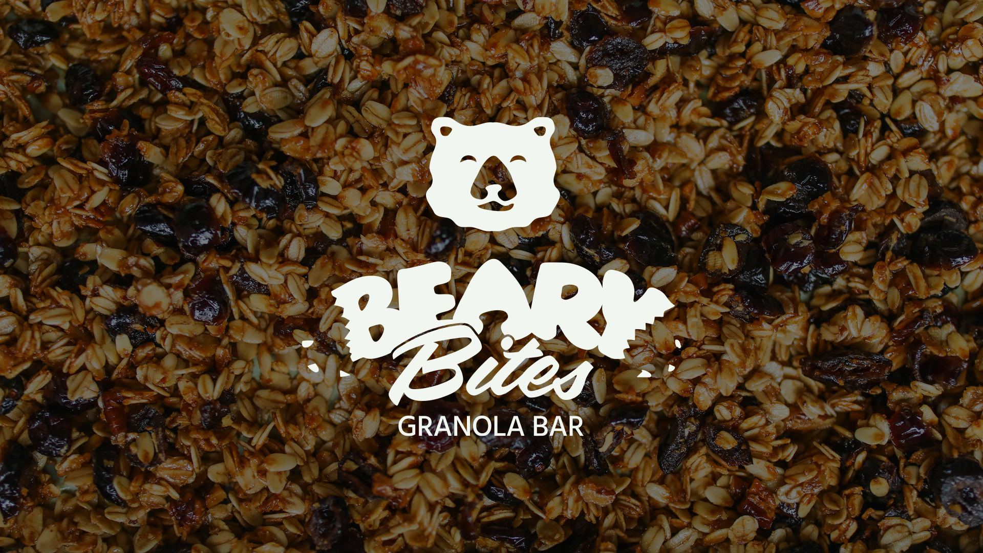
The word mark consists of a bold typeface (“Beary” – Eds Market Bold), a dynamic typeface (“Bites” – Filmotype LaSalle) and a neutral tagline (“Granola Bar” – Hind Vadodara).
The bold typeface has either been torn apart or eaten by a bear – either way, there are some crumbs left on the sides. Mixing the two main fonts and adding some background story is meant to shake things up a bit and make the logo an interesting eye-catcher.
The bear is visibly happy because he has just had a snack. If you look closely, you’ll see that the bear’s nose is actually the “A” in “Beary”. Recurring elements build brand awareness, especially when done discreetly.
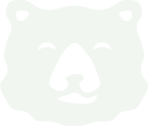
There are three versions of the logo. The single wordmark is best suited to horizontal rectangular spaces, while the signet (bear’s head) is perfect for round or square spaces.
Colors
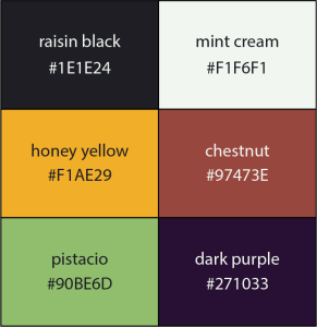
Not only do the colours match, but their shades and names represent some of Granolabar’s ingredients: raisin, mint, honey, chestnut and pistachio. Yellow, green and purple, which in colour psychology represent happiness, strength and growth, are used to evoke the fun and vibrancy of the brand.
Mockups
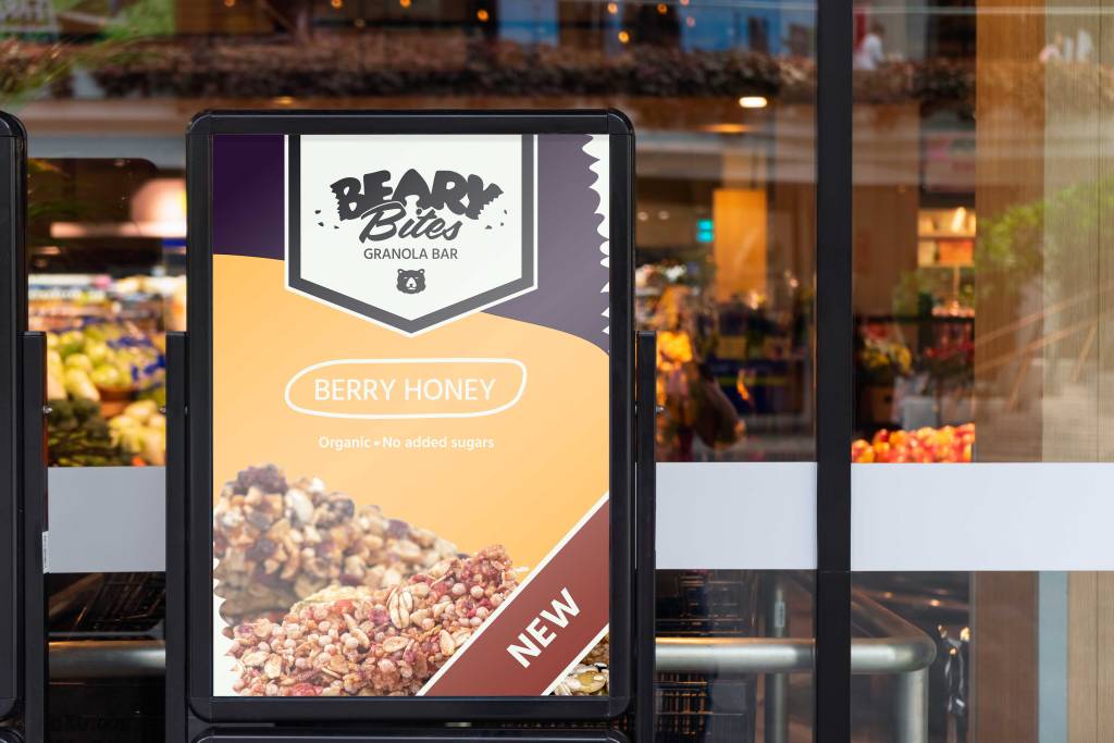
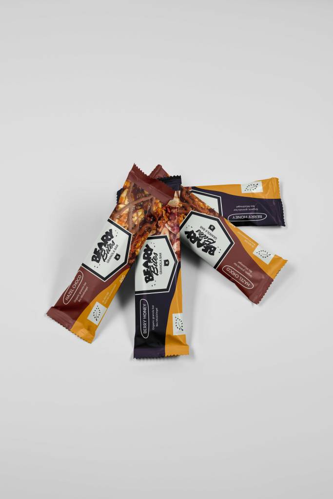
The packaging showcases both the product through images and the brand through its colours (and logo). The variable colour palette makes it easy to represent different flavours: ‘chestnut brown’ and ‘honey yellow’ were chosen for the ‘hazelnut chocolate’ flavour, while ‘dark purple’ and ‘honey yellow’ were used for the ‘berry honey’ variant. The contrast color ‘mint cream’ works well with the logo and the EU organic label. The flavour name is framed by an imperfectly drawn stroke, giving the packaging a fun and relaxed feel.
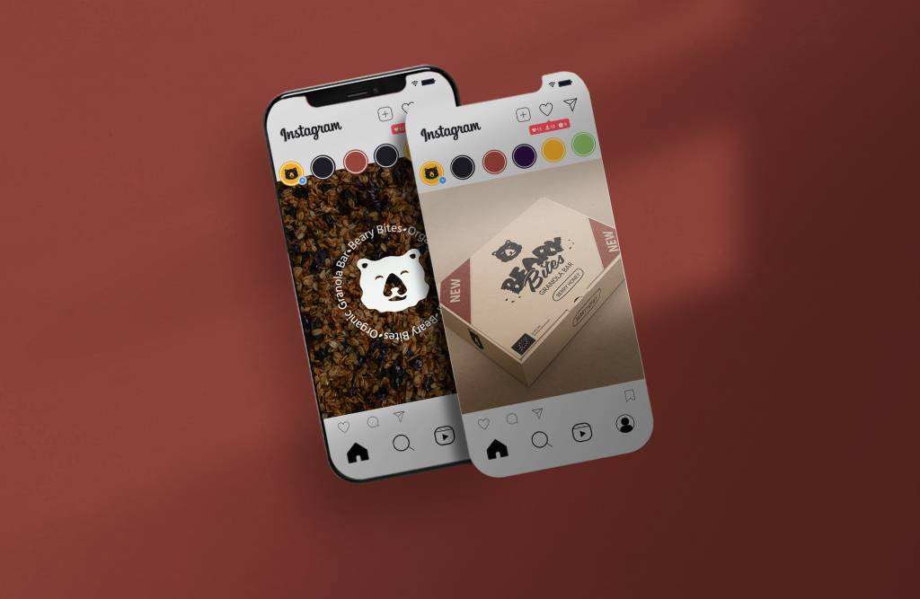
This Instagram mockup shows the different logo types and colour palette. In reality, the Instagram feed would also include people consuming the product, as well as insights into the production and retail sail.
Finally, let me show you an example of an advertisement introducing a new flavour of Beary Bites. You will probably recognise the colour palette and the typefaces. Parts of the poster appear to be torn apart (by a bear’s claws or fangs), just like the logo.