Branding Process
Moodboard
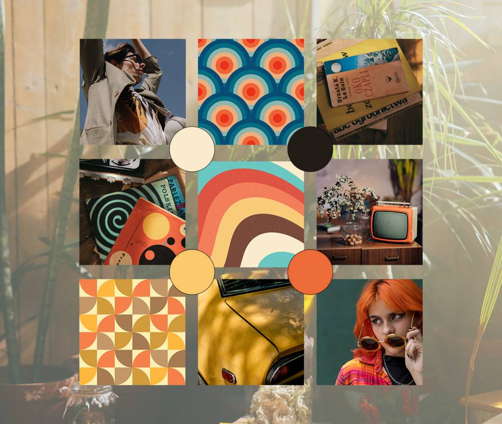
Young and outgoing, bold and stylish – Nova’s target group are the trendsetters of Gen X and Y. My aim was to accentuate the warm, washed-out tones and geometric patterns you can see in the mood board. The brand’s direction of choice screams nostalgia, summer and hanging out with like-minded people.
Logo
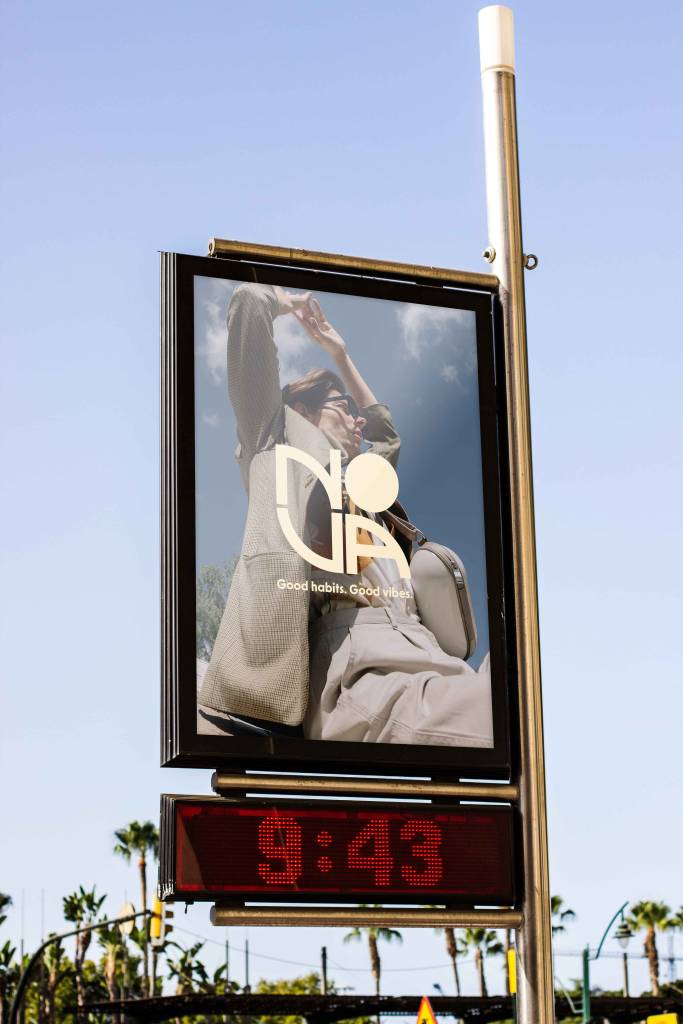
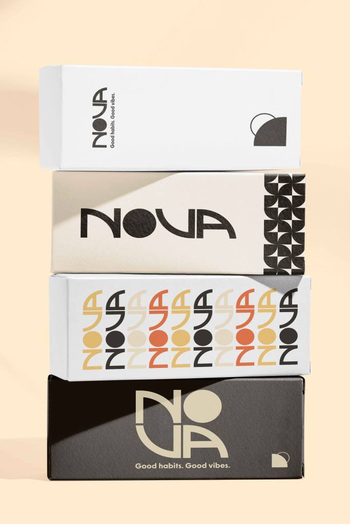
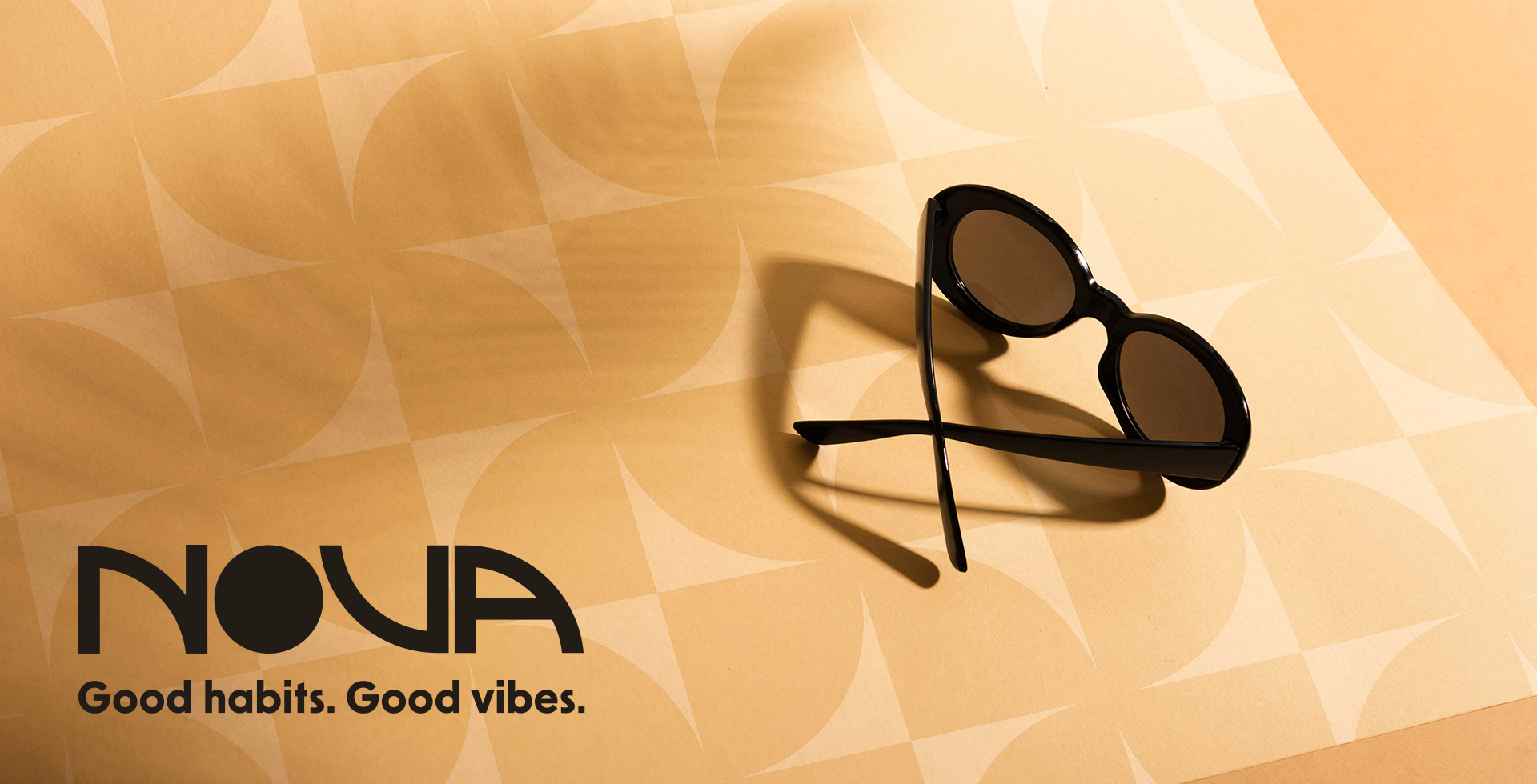
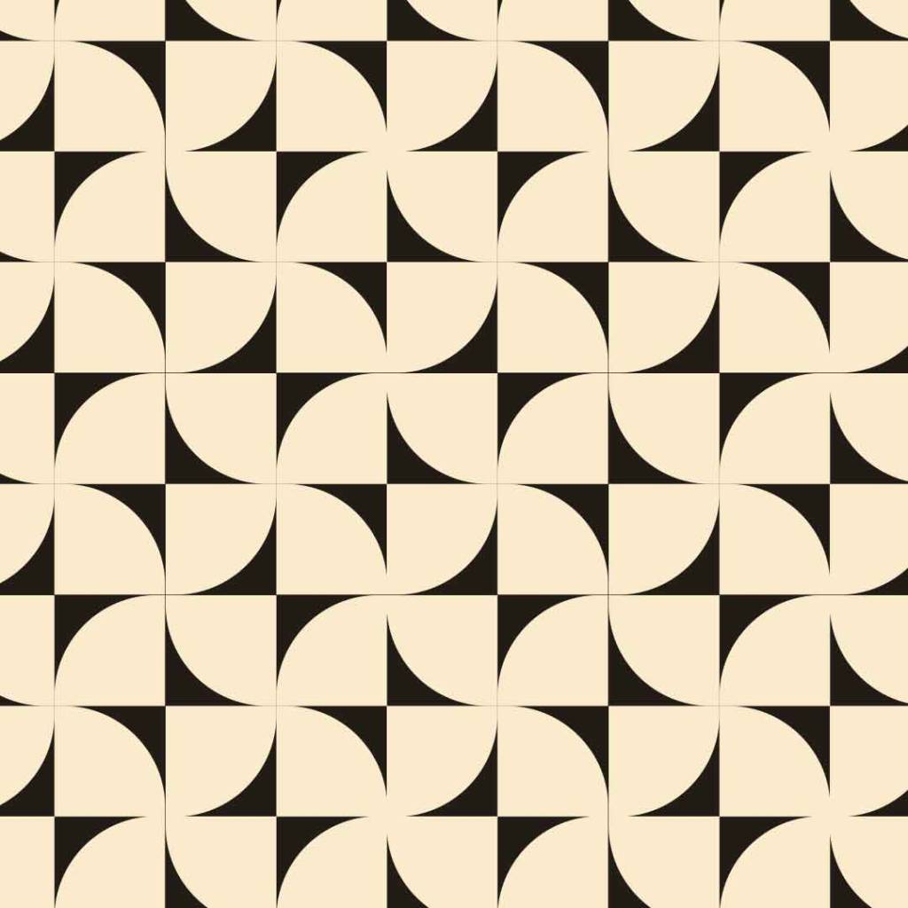
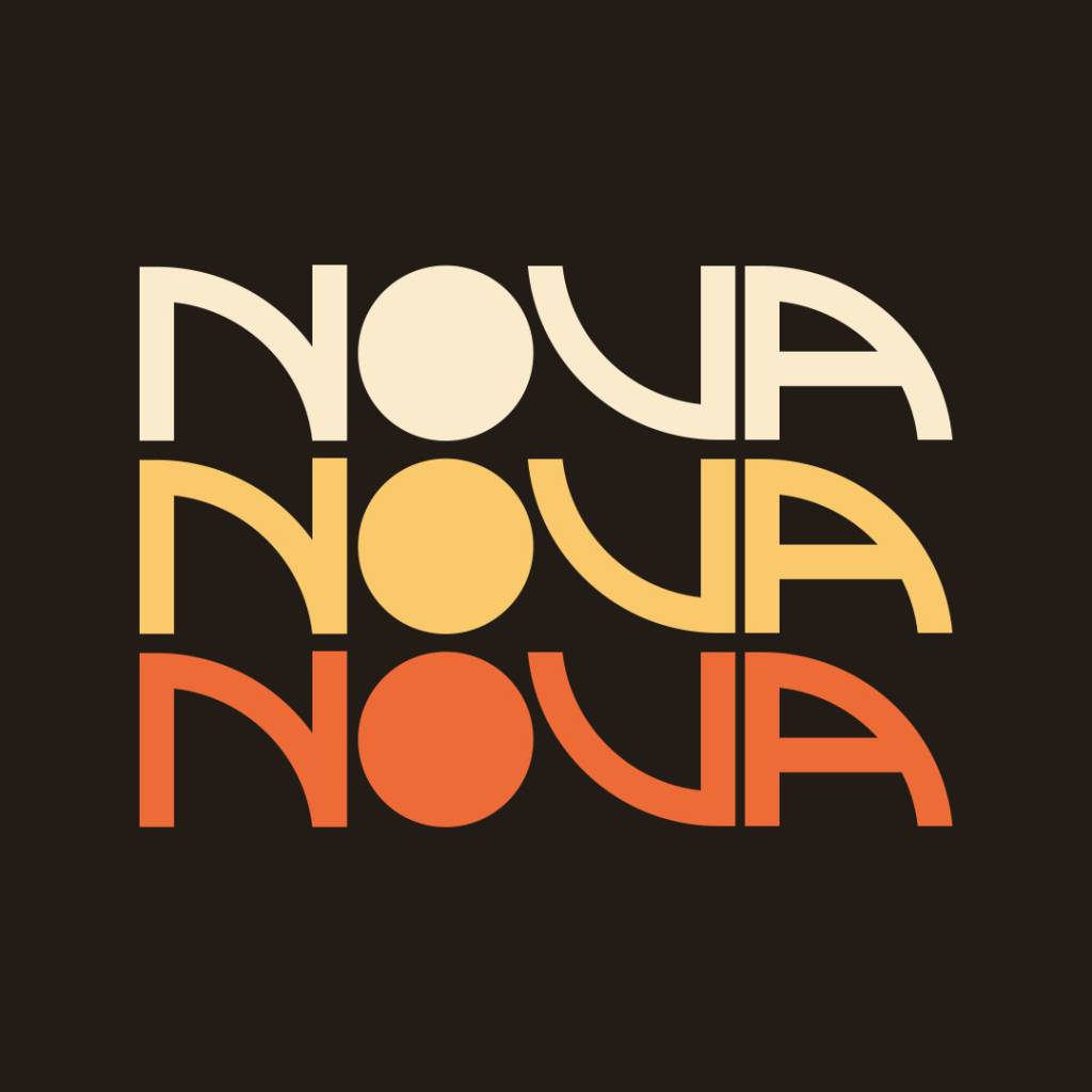
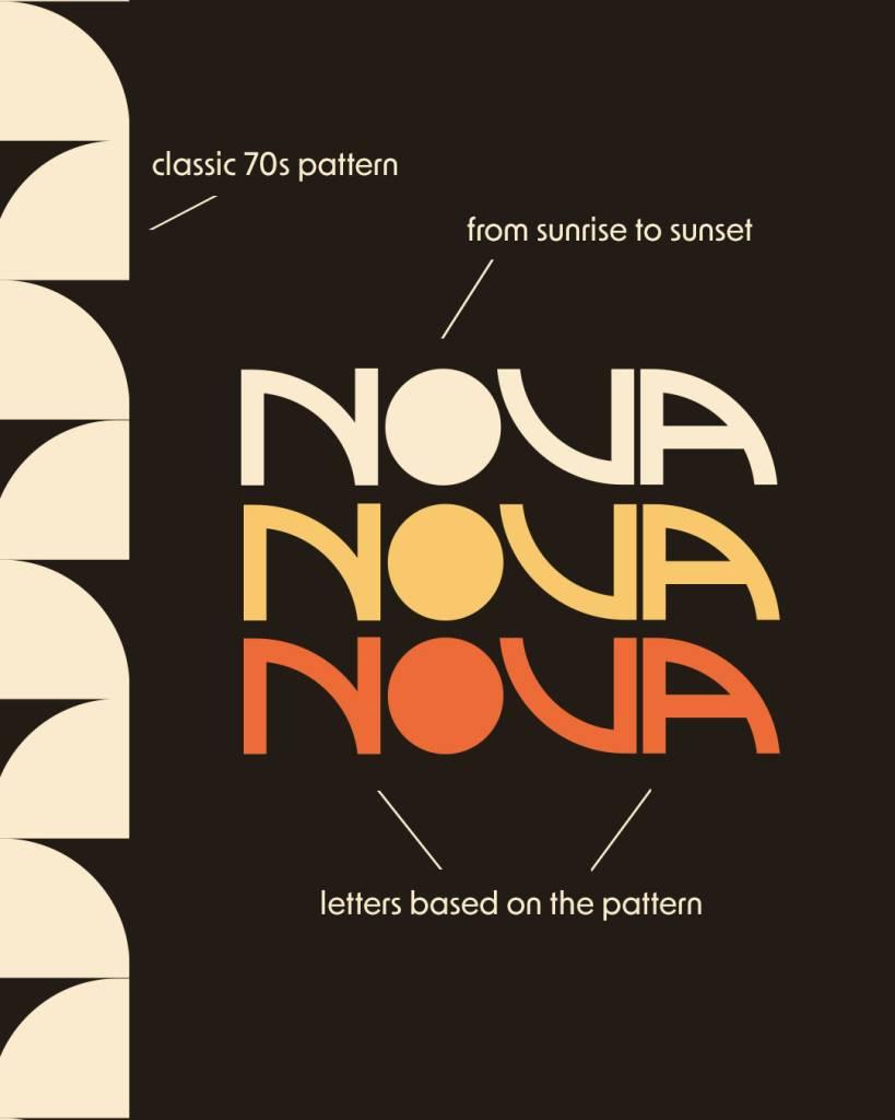
First, I created a 70s-inspired brand pattern, which I then used to create the letters. Only the O is out of shape. It represents the sun – moving from sunrise to sunset. The signet logo is a simple combination of the primary logo: the sun is partially covered, either on its way to dawn or on its way to sunrise.
Mockups
