Branding Process
Moodboard
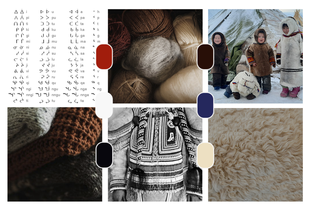
The moodboard creates a branding’s setting and is further designed to communicate the brand’s values and emotions. Here, the company’s native background was found to be central to the brand’s communication.
The images include Inuktitut syllabics, images of Inuktitut children and a traditional garment. The cultural imagery is accompanied by earth-coloured wool in three stages: as a finished garment, as a bag of wool, and as plain fur. Another major influence, for which I was unable to find a royalty-free image, are traditional women’s parkas (“amauti”). These often have a rounded shape at the bottom, which was later used in the logo design process.
The colours come from the imagery: Earthy colours are accentuated by red and blue, just like traditional Inuktitut clothing.
The keywords in this moodboard are warmth, tradition and timelessness. Can you feel it?
Logo
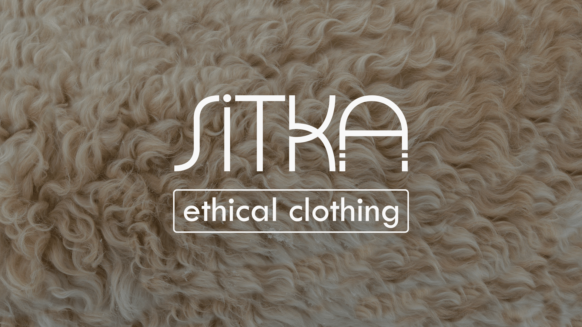
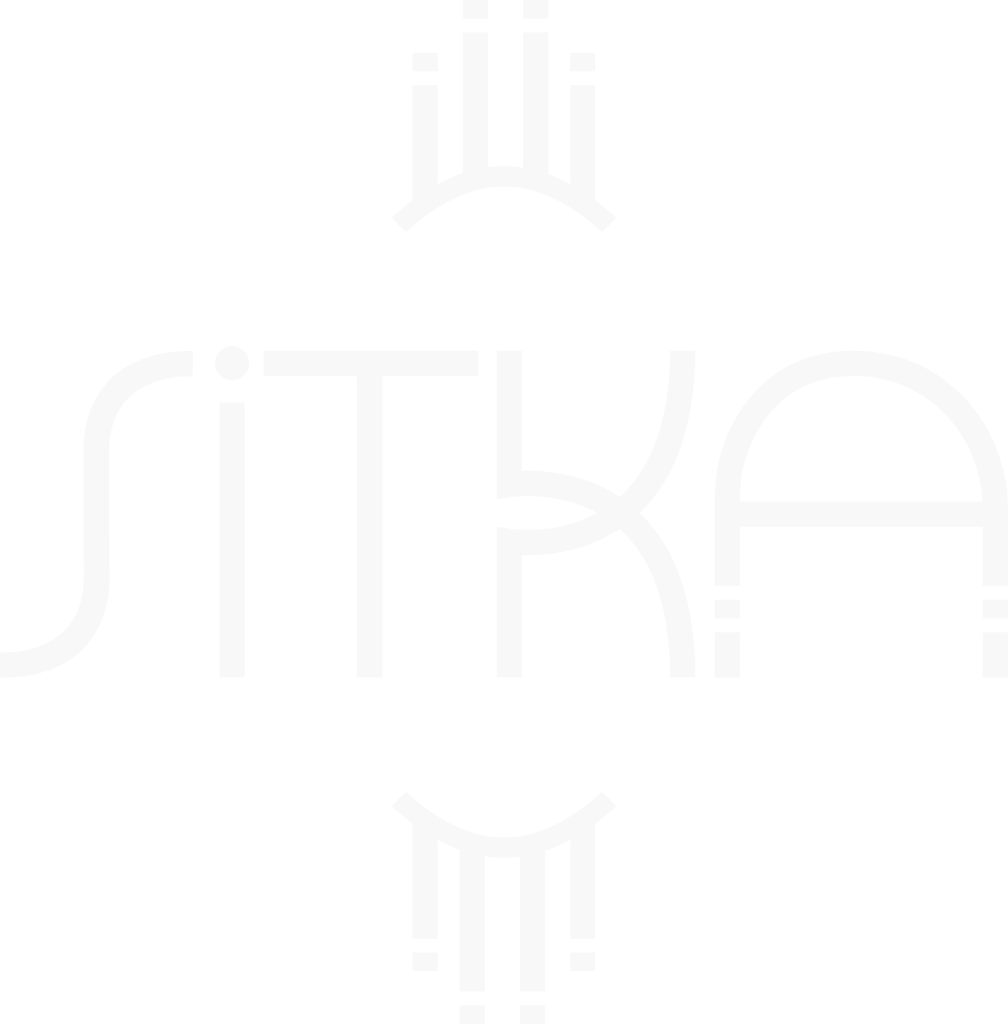
The wordmark of the logo was mainly inspired by Inuktitut syllabics, which I reassembled into Latin letters (the design process is roughly shown in the video). By reinterpreting the Inuktitut letters, I aimed to give the logo an ethnic and original feel. The two details in the lower half of the letter “A” add to this: they represent two plaits.
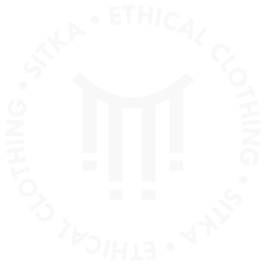
The signet is derived from the aforementioned “amauti”, a traditional women’s parka. These are often round or oval in shape, and some have tassels at the bottom. The shield is a simple abstraction of this. The details of the submark match the “A” of the primary logo, making it easy to recognise as part of the Sitka brand.
The primary logo is the most eye-catching, but also the most complex. It can be placed in round and square spaces that are large enough to ensure legibility. I used this logo only with sufficient white space around it to avoid visual overload. The secondary logo nicely matches horizontal rectangular spaces, such as head sections. The signet can replace the other logo types if space is limited. Since it doesn’t communicate the brand name, it should be used primarily in communications with existing customers or in combination with the wordmark.

From left to right: primary, secondary and signet logo, plus a signet variation.
Pattern
In keeping with the brand identity, the pattern is derived from Inuktitut embroidery. By cropping and stacking, it can be easily adapted to all kinds of white space. The pattern can be used to fill white space on the website, packaging, business cards or similar items.
Typeface
The typeface of choice is Tw Cen MT. The regular sans serif font has a friendly feel with many rounded letters. It is simple enough not to distract from the logos or overload any composition.

Mockups
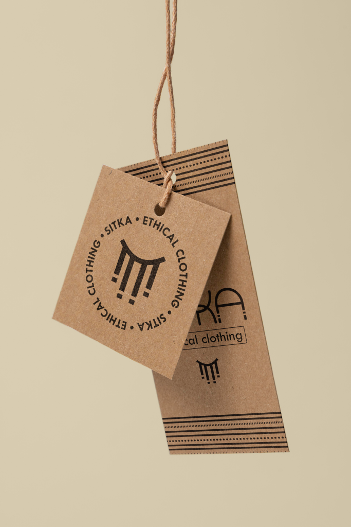
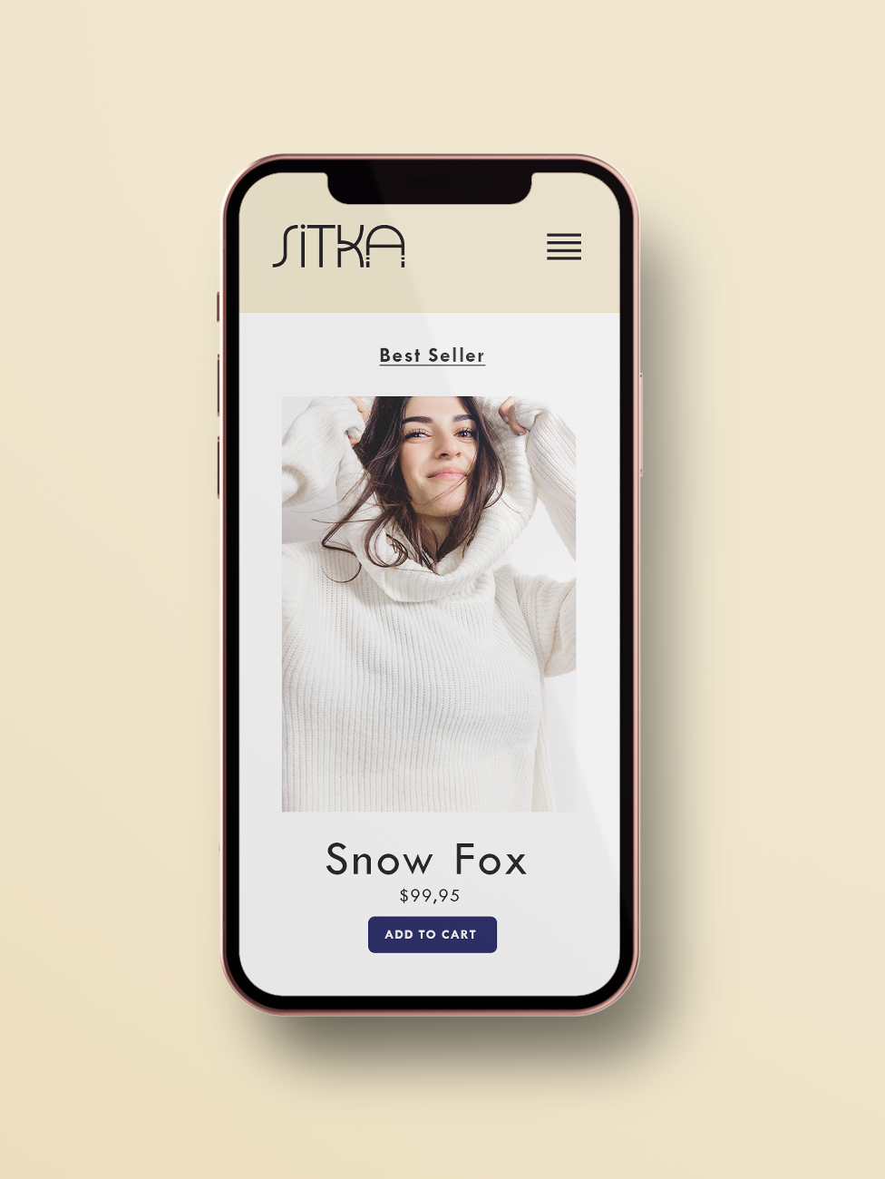
The material of the clothing tag has a natural, unmanufactured feel, reinforcing the purity and sustainability of the Sitka brand. We see two logos in action: The primary logo works well on the vertical layout, especially in combination with the brand pattern. The secondary logo works well on the square.
The app or webshop mockup is clean, timeless and calm, while representing the brand’s professionalism and high quality standards. In colour psychology, blue represents trust and professionalism, making it the perfect colour for the ‘add to cart’ button. The beige adds a little warmth to the shop and reappears in the footer.
The focus of this webshop is on the products, which are therefore featured prominently. The images are meant to convey fun and human connection. Finally, the name of the piece (“snow fox”) refers to the fact that all materials are sourced cruelty-free in Alaska.